

Brand assets & Guidelines
Official guidelines and assets for the CleanProxies brand.
File size: 8.9 MB
Naming
CleanProxies is written as one word with capital C and P. It represents both the brand and its core product.
Use additional words only for specific offerings. All features and proxy types should be written as proper nouns, like CleanProxies ISP or CleanProxies Residential.
Use additional words only for specific offerings. All features and proxy types should be written as proper nouns, like CleanProxies ISP or CleanProxies Residential.

Wordmark
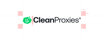
The CleanProxies wordmark is the primary logo and should be used in most cases.
Use the dark version on light backgrounds and the light version on dark backgrounds. Always keep enough spacing around it for clarity.
Use the dark version on light backgrounds and the light version on dark backgrounds. Always keep enough spacing around it for clarity.

Symbol
The symbol is used where the full logo does not fit, such as icons or small UI elements.
Do not modify it. Keep it clear and properly spaced.
Do not modify it. Keep it clear and properly spaced.


Colors
The color system reflects speed and reliability, using strong accents with clean neutrals.
Use accent colors for key actions and keep the palette consistent across all designs.
Use accent colors for key actions and keep the palette consistent across all designs.
CleanProxies Green
RGB 3, 211, 108
#03D36C
Pantone 7480 C
Core Dark
RGB 29, 32, 38
#1D2026
Pantone 433 C
Signal White
RGB 255, 255, 255
#FFFFFF
Pantone White
Icon
The CleanProxies icon represents simplicity and reliable infrastructure. The cloud form reflects distributed networks, while the subtle expression adds a friendly, approachable feel.
The sparkle highlights speed and performance. Color variations can be used across different contexts, but the shape should always remain consistent and clearly visible.
The sparkle highlights speed and performance. Color variations can be used across different contexts, but the shape should always remain consistent and clearly visible.




CleanProxies is a living system, constantly refining, evolving, and improving to stay faster, sharper, and ahead of what’s next.